Generative Ai
Start with a Design Guide in Claude Design

Introduction
If you run a small business, there’s a good chance your website, your proposals, and the handouts you give clients were made at different times, by different people, in different tools. Each one looks fine on its own. Put them side by side, though, and they don’t quite look like they came from the same company.
I ran into this recently on a side project: setting up the brand and website for a new business that had little more than a few rough documents to its name. I used Claude Design, Anthropic’s design tool, and instead of starting with the website, I started with a design guide (also called a style guide or design book). That’s one document that records the business’s colors, fonts, logo, and voice, along with the building blocks its pages are made of.
In this article, we’ll walk through how I built that design guide in Claude Design, how I used it to style and publish a landing page, what the whole thing took in hours, and what to watch out for if you try it yourself.
What Claude Design is
Claude Design is Anthropic’s tool for creating visual work, like pages and documents, by describing what you want to Claude. At the time of writing, it’s available on the Free, Pro, Max, Ultra, Team, and Enterprise plans and turned on by default. Anthropic’s Get started with Claude Design guide covers setup and the basics, so I won’t repeat them here.
You talk to it the way you would in a regular Claude conversation, you can give it your existing files to work from, and it produces designs you can look at and keep refining. When a design is ready to become a real website, you can export it to Claude Code, Anthropic’s coding tool, which turns it into working code.
In my experience, Claude Design works like a very capable designer who doesn’t know your business yet. Without the right guidance, it won’t reliably follow best practices: making a page work on phones and tablets, keeping text readable against its background, or writing copy that sounds like your business. Those things have to come from you, or from a skill (a saved set of instructions Claude applies when it works, which you can learn more about in Automating Repetitive Work with Skills and MCP ). That’s a big part of why I started with a design guide.
Why start with a design guide
A design guide is the reference that everything a business puts out gets made from. Ours recorded the business’s offerings, its mission and values, the words and phrases it uses to describe itself, its logo, fonts, and colors, and, by the end of the project, the components its web pages are built from.
Without a guide, every new document starts from a blank page, and whoever makes it makes their own calls on fonts, colors, and wording. That’s how a business ends up with a website in one shade of blue, a proposal in another, and a handout in a font nobody remembers picking.
With a guide in Claude Design, those calls are already made. The landing page I’ll describe below was the first thing built from ours, and the same guide can style whatever the business needs next, like a how-to sheet or handout for its clients. Those will match the website because they come from the same source. For a small business, that kind of consistency goes a long way toward looking professional, and once the guide exists, keeping it up doesn’t take much extra work.
Building the design guide
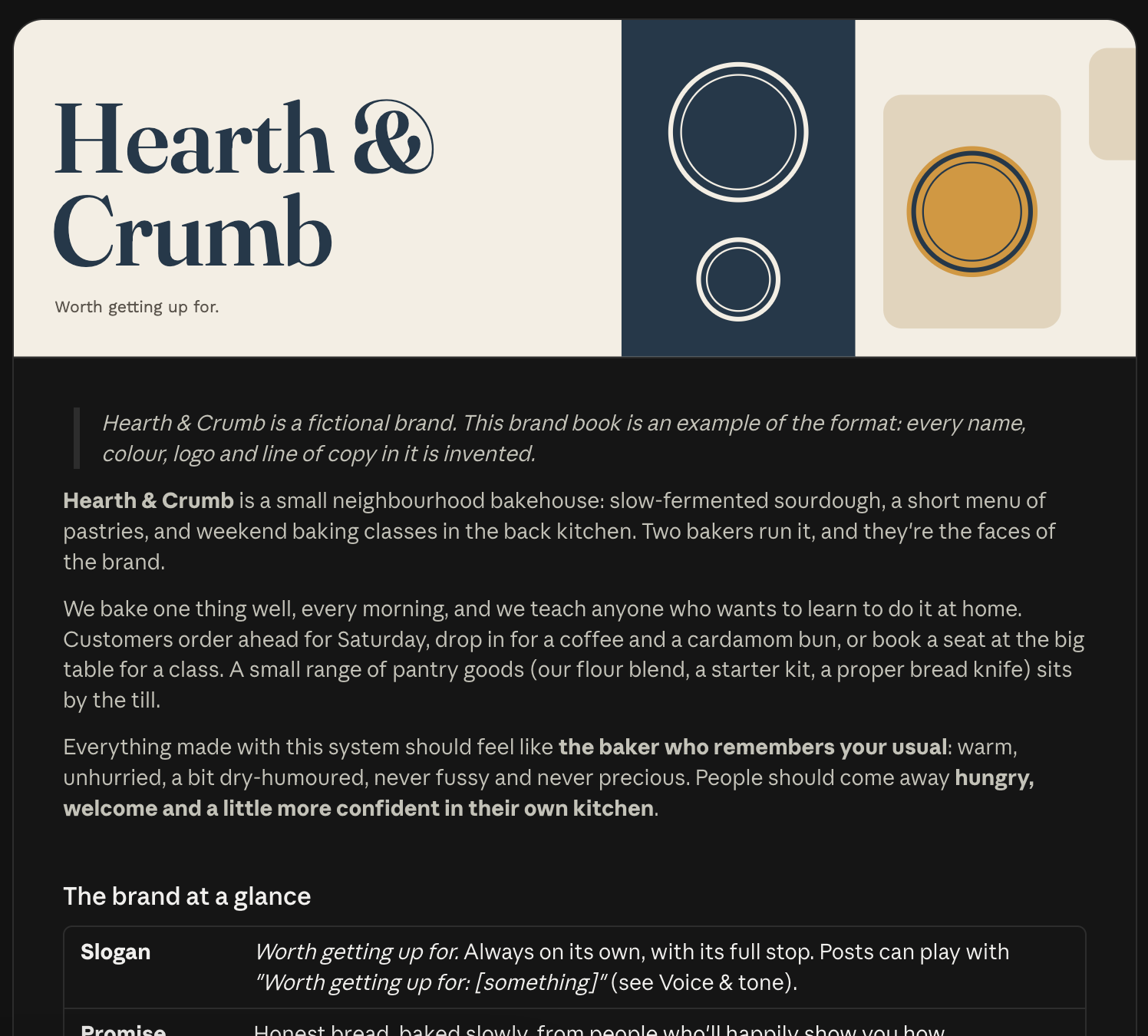
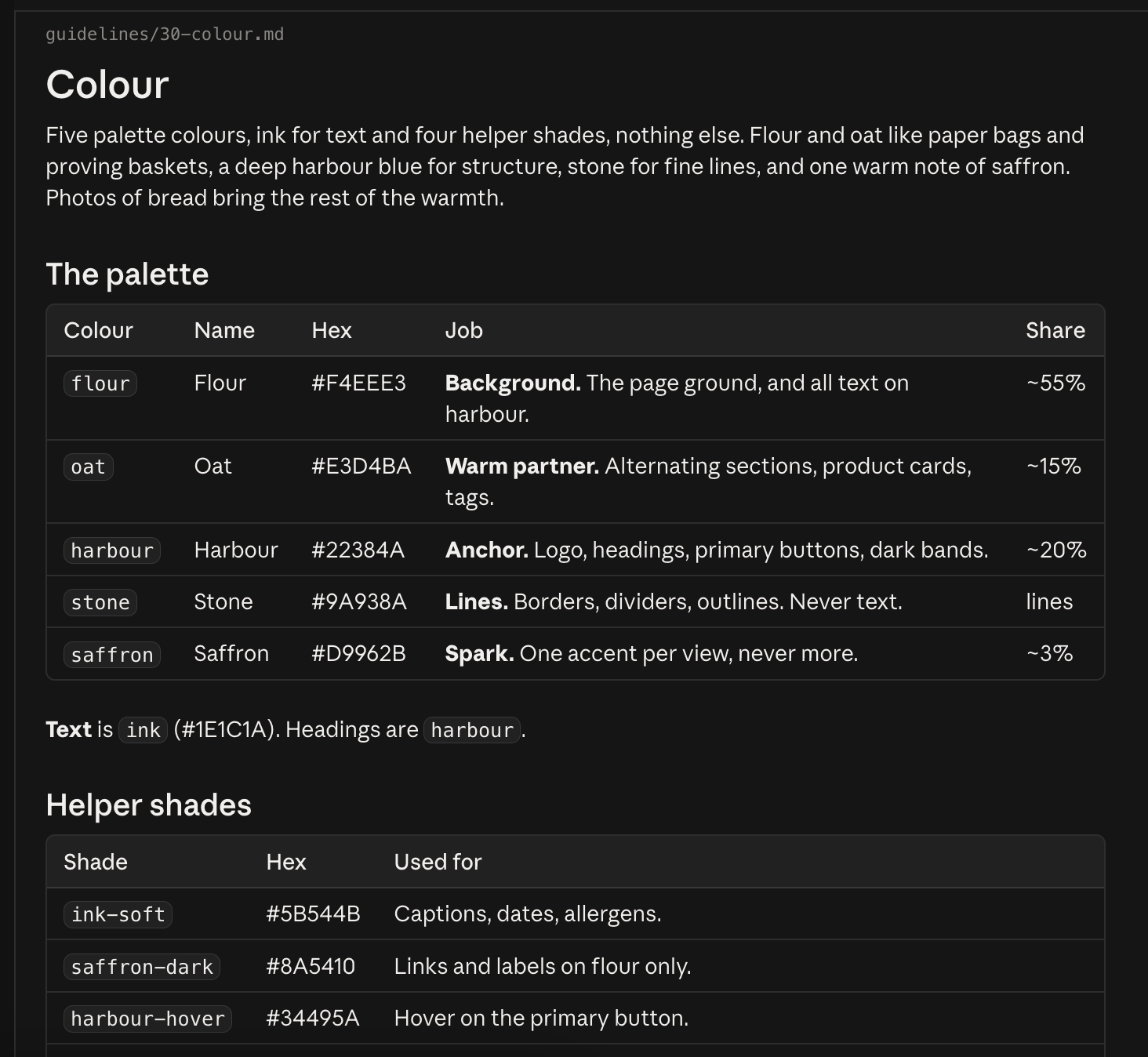
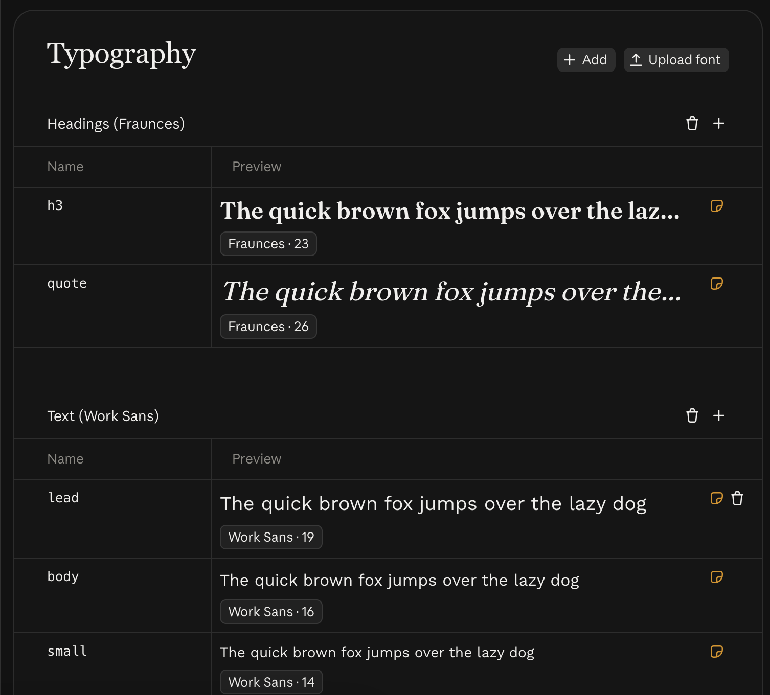
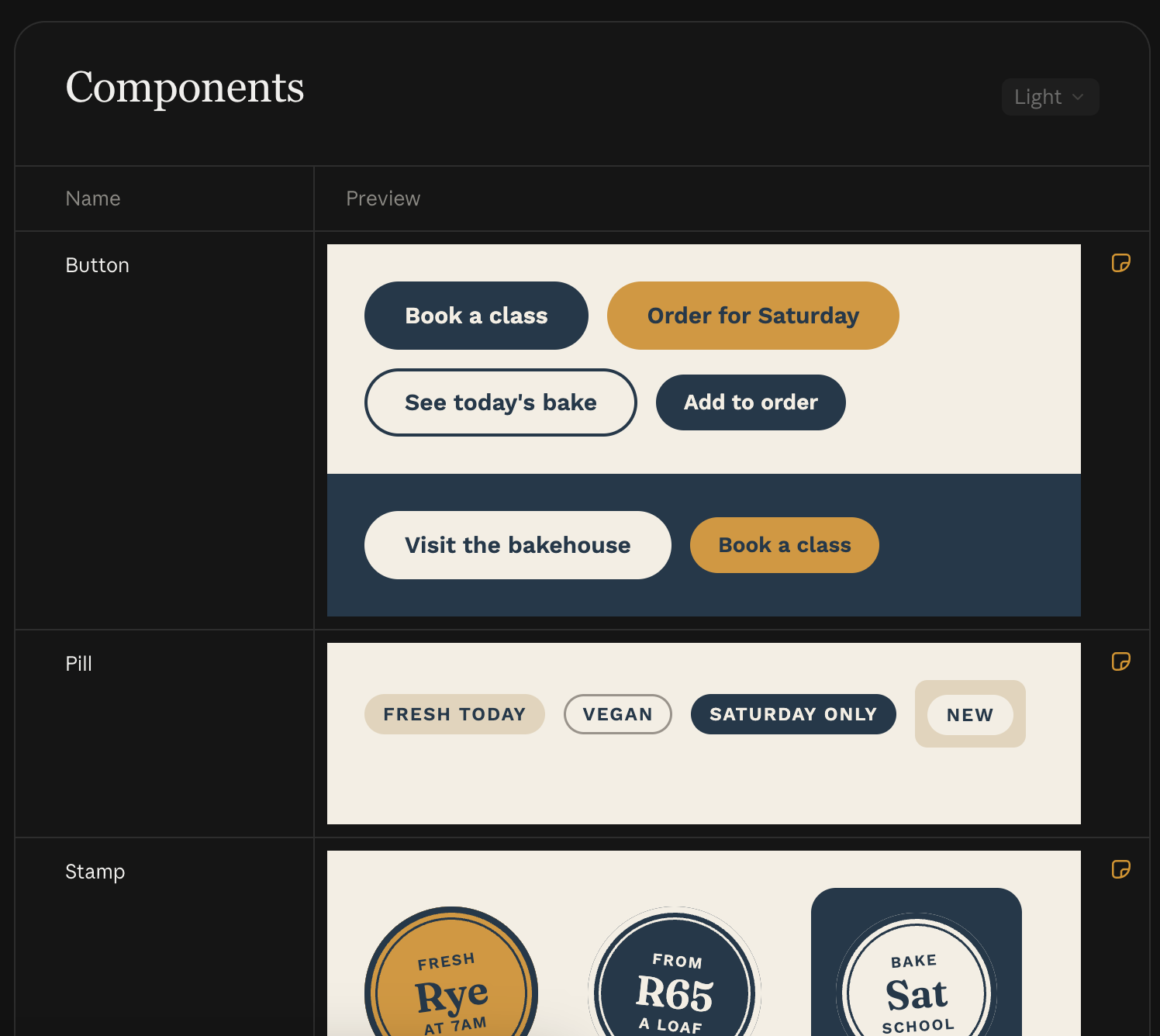
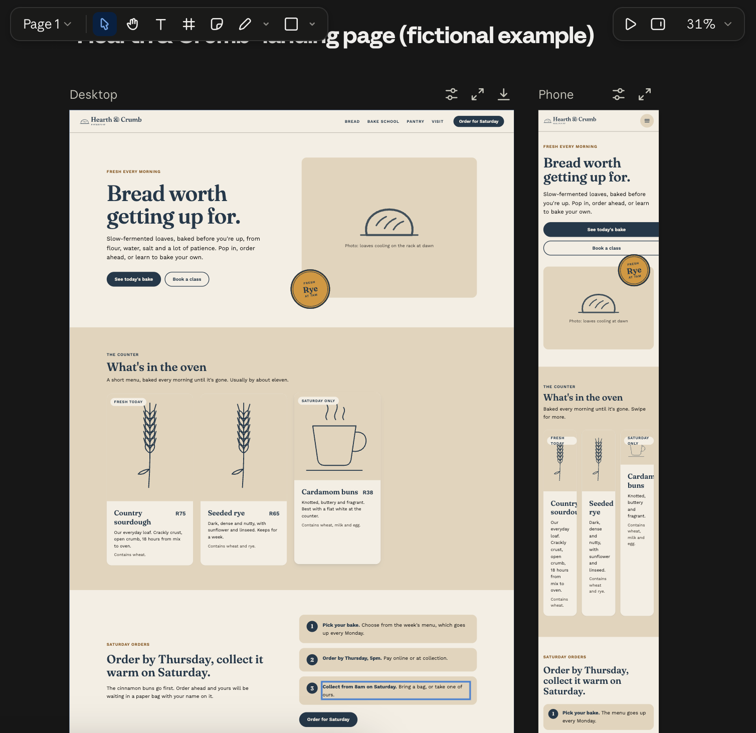
I can’t share the real design guide, so the screenshots in this post come from a fictional example brand, a bakehouse called Hearth & Crumb, made in Claude Design to show the same format. Its names, colors, and fonts are different from the ones I describe below, but the structure is the same. And when I say “we” below, I mean Claude and me working through it together.
Before designing anything, I gathered what the business already had: its logo, its colors, an old style guide, and some photos. Then Claude walked me through a step-by-step interview about the business: the services it offers, who its clients are, its tone, and the channels it uses to reach people (the website, Instagram, and WhatsApp).
Defining the brand in words
From that interview, we wrote the parts of the guide that describe the business in words: a short introduction, the brand promise, the approach, and how the business positions itself. We defined who it’s talking to (four distinct client groups, each with its own name and needs) and wrote its mission, beliefs, and core values. We also gave each service one consistent name, set the voice and tone, and settled on a short slogan.
This part is easy to skip because it doesn’t look like design work. In my experience, though, it’s what keeps the copy Claude writes later sounding like the business.
Visual foundations
With the words in place, we moved on to how the business looks. Claude pointed out that some color combinations in the existing palette didn’t have enough contrast, which makes text hard to read, especially for people with low vision. We cut the palette down to five colors (Black Forest, Bone, Khaki, Dusty Taupe, and Chocolate) plus text colors, and checked every text and background pairing for contrast.
For type, we chose Belleza for headings and Raleway for body text, and kept the font files in the guide. For spacing, rounded corners, and shadows, we adopted Open Props , a free set of ready-made design values, so every measurement comes from one standard set instead of being picked by eye each time.
The logo was cleaned up and redrawn as vector files (images that stay sharp at any size), in light and dark versions. We generated a library of hand-drawn line illustrations with an image generation tool connected to Claude, turned them into vector files, and recolored them to the palette. Finally, we wrote rules for photography, like using rounded corners and when text is allowed to sit on top of a photo.
Components
Components are the reusable building blocks a page is made from, like a header, a footer, or a card describing one service. The first version of the guide had none, so I built them from real examples. I shared reference designs (pages from other sites whose look I liked) one at a time, and Claude turned each idea into a reusable component in the guide. By the end, the guide had arch-shaped images, curved sections, heroes (the large banner at the top of a page), a header and footer, service cards, an FAQ, a call to action, testimonials, before-and-after images, a price card, and forms. We also added a set for a blog: post cards, a blog home page, an article layout, and an author box.
The components that made the guide feel specific to this business were the small touches: a print-style color offset behind photos, a paper texture, and hand-drawn motifs scattered around sections. Every component got short written notes on when and how to use it, plus a live preview.
Next, I used the frontend-design skill to run a design pass over the components, adding depth and removing details that looked generic or template-like. We also merged components that overlapped, added compact layout options, and fixed problems we spotted in the previews, such as components sized badly at some screen widths. Almost every component got adjusted at some point to suit the look we were going for: sometimes that meant a color change, sometimes finding an example of a layout we liked better and rebuilding the component from it.
Audits
Before using the guide for anything real, we audited it twice. The first audit was for consistency: label styles, option names, the type scale (the set of text sizes), and color names all had to follow the same conventions, so the guide would be predictable for whoever uses it next, Claude included. The second, with an accessibility audit skill , checked the guide against WCAG 2.2 level AA, the current version of the standard most accessibility laws reference. It caught contrast problems where text sat on photos, along with issues in keyboard use, focus visibility (being able to see which element is selected as you tab through a page), zooming, and pausing motion. We checked every fix with before and after screenshots at desktop and phone sizes.
An automated audit is a good start, but it won’t catch everything. Even a 2021 study by Deque , a company that makes those tools, found they caught 57% of issues, so testing with a keyboard and a screen reader is still worth doing. We cover the rest of that checklist in WCAG Accessibility for Project Managers .
To sum up the process, start with words (who you are and who you serve), lock the foundations (color, type, and spacing), build components from real reference examples, and audit for consistency and accessibility before you use it.
Building the landing page
Building the page itself went quickly once the guide was done. In Claude Design, I selected the guide as the design system (Claude Design’s name for a saved guide like this), then wrote a brief for the page as a plain bullet list: which sections the page should have, in what order, and which components each one should use, with sub-bullets for any extra guidance. That took about 30 minutes. From that list, Claude generated a first version of the page in about 10 minutes. It worked on a desktop screen, but it still needed refining.
Over the next one to two hours, I tweaked components on the page to get the look I was aiming for, one change at a time, checking each against the guide’s brand rules. Building a real page also showed what the guide was missing, so we spent another two to three hours adding the components it needed. Throughout, we kept updating the design guide to match what we actually used on the page, so the guide and the website never drifted apart.
Once I was happy with the desktop version, I asked Claude to generate two more breakpoints (the screen widths at which a page rearranges its layout), so the page had small, medium, and large layouts for phones, tablets, and desktops. That took about 30 minutes. A final pass on the page’s copy took about an hour.
Handing off to Claude Code and publishing
A design in Claude Design isn’t a website yet. To get there, I exported the project from Claude Design to Claude Code and asked it to build the page with my preferred static site generator (a tool that turns templates and text into plain web pages, which are fast and inexpensive to host). That took about 30 minutes, and publishing the result to a hosting service took another 30.
Because the components and breakpoints were already worked out in Claude Design, there was very little left to decide at this stage.
How long it took
Here’s roughly how the hours broke down, from the first conversation to the page going live:
- Gathering existing material and the interview about the business: 2 hours
- Defining the brand in words: 1 hour
- Visual foundations (colors, type, logo, and illustrations): 1 to 2 hours
- Building components from reference designs: 3 to 5 hours
- Design pass with the frontend-design skill: 1 to 2 hours
- Consistency and accessibility audits: 2 to 3 hours
- Writing the landing page brief: 30 minutes
- Generating the first version of the page: 10 minutes
- Tweaking components on the page: 1 to 2 hours
- Adding missing components: 2 to 3 hours
- Adding small and medium breakpoints: 30 minutes
- Copy pass: 1 hour
- Building the page in a static site generator with Claude Code: 30 minutes
- Publishing: 30 minutes
That comes to roughly 16 to 23 hours, or about two to three working days of focused work. Your numbers will depend on how much material you start with and how particular you are about the result.
Without AI, I’d expect a project like this to take at least a couple of weeks, and the business also came away with a design guide it can keep reusing.
What to watch out for
As I mentioned earlier, Claude Design follows the guidance you give it. Anthropic’s own notebook on prompting for frontend aesthetics puts it plainly: “Claude has strong design capabilities but defaults to safe, generic choices.” It suggests three ways past those defaults: direct Claude’s attention to typography, color, motion, and backgrounds individually, reference concrete design inspirations, and explicitly tell it to avoid its tendency toward generic choices. Looking back, that’s roughly what building the design guide did. The visual foundations dealt with color and type one at a time, the components came from real reference pages, and the frontend-design pass was there to strip out generic, template-looking details.
Skills cover the parts you might not think to ask for. A skill packages up instructions for a specific job, so Claude applies the same checks every time instead of relying on you to remember them. On this project, the frontend-design and accessibility audit skills did a lot of that checking. A few other skills I didn’t use on this project are also worth a look:
- webapp-testing , from Anthropic, for testing web pages
- Impeccable , a set of design skills for building new interfaces, improving existing ones, and keeping them consistent with your design system
- UX writing , for the copy on a page
- design critique , for feedback on a design
Skills come with a risk of their own, though. A skill can contain executable code, and anyone can publish one, so treat an unfamiliar skill the way you’d treat an unfamiliar email attachment. Read through what it does before you install it (if you’ve never looked inside one, How to Write a Claude Code Skill shows what a skill file contains), stick to sources you trust, and give community skills (including some of the ones above) a closer look than ones from Anthropic’s own repositories. If you’re setting up Claude for a team, admins can also restrict which skills people are allowed to use. We walked through those controls in our webinar on safely rolling out Claude for small businesses .
There are also cases where Claude Design isn’t the right tool. At the time of writing, it has no Figma export, and while you can drag, resize, and nudge elements on the canvas, it isn’t a full design editor like Figma. If your team hands designs over in Figma, or you need fine-grained control over every element, you’ll want a different tool for that part of the work.
Finally, the usual security and privacy risks of using AI apply here too. Everything you upload to build a design guide (logos, old documents, photos, details about the business and its clients) goes to an AI provider, so check how your Claude plan handles that data and leave out anything you wouldn’t share with a vendor. Claude for Small Business: Safe and Simple covers how data handling differs between Claude plans, along with the settings and habits that make it safer to roll out to a team. And if you’re building a design guide for someone else’s business, as I was, treat their material with the same care.
Conclusion
In this article, we walked through how I built a design guide for a new business in Claude Design: the brand in words first, then color, type, and spacing, then components built from real reference pages, and finally audits for consistency and accessibility. We then used that guide to build a landing page, hand it off to Claude Code, and publish it, in roughly 16 to 23 hours of work.
In my experience, the real work is giving Claude all the context it needs, and knowing your own brand and voice well enough to steer it toward the design you have in mind.
A natural next step is generating more of the site’s visual media by connecting Claude to an external image or video generation service through a connector (MCP). That’s a bigger topic than fits here, and the features and limits described in this article will likely change as Claude Design matures. In the meantime, Turning User Ideas into AI-Generated Designs shows how much structure image generation needs to produce on-brand results.
Want help putting tools like Claude Design to work in your business? Let’s talk.